
Why you need responsive web design
Responsive design is a critical element to consider when building a website right now. However, if you’re not a designer you could be wondering what this means.
In fact, if you’re a business owner, you’re probably more intrigued by this concept and how implementation could benefit you.
At
Infoserve, we’ve seen first hand just how responsive design can help you solve problems on your website. A responsive design will make your website mobile-friendly, enhance the way it looks over a number of devices and increase the amount of time visitors spend on your website. It can even help improve your rankings in search engines!
What is responsive design?
Good question, essentially responsive design is a way a website is expertly designed so that it automatically scales all content and intricate elements to match the screen size a user is viewing from. This makes for a much better user experience as visitors don’t have to do extra work to read your content, or will large images block their viewing.
People want instant gratification. They don’t want to spend unnecessary time scrolling, zooming and resizing your website just to receive the information they want.
If your website is difficult to navigate it will lose you potential customers.
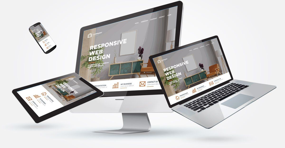
This doesn’t mean designing multiple websites to suit a computer, laptop, tablet or mobile device, it’s designing one website that scales up or down to suit the user and the device it’s being viewed on.
Responsive design is a critical element to consider when building a website right now. However, if you’re not a designer you could be wondering what this means.
In fact, if you’re a business owner, you’re probably more intrigued by this concept and how implementation could benefit you.
At
Infoserve, we’ve seen first hand just how responsive design can help you solve problems on your website. A responsive design will make your website mobile-friendly, enhance the way it looks over a number of devices and increase the amount of time visitors spend on your website. It can even help improve your rankings in search engines!
What is responsive design?
Good question, essentially responsive design is a way a website is expertly designed so that it automatically scales all content and intricate elements to match the screen size a user is viewing from. This makes for a much better user experience as visitors don’t have to do extra work to read your content, or will large images block their viewing.
People want instant gratification. They don’t want to spend unnecessary time scrolling, zooming and resizing your website just to receive the information they want.
If your website is difficult to navigate it will lose you potential customers.
This doesn’t mean designing multiple websites to suit a computer, laptop, tablet or mobile device, it’s designing one website that scales up or down to suit the user and the device it’s being viewed on.
5 reasons to invest in responsive design
We live in a society that uses multi-screens daily.
How many people do you see scrolling on their phone while looking at their laptop or tablet?
It’s so important that your site is viewable over as many devices as possible in order to appeal to the broadest number of people.
As well as delivering a sleeker look, some of the benefits of choosing responsive design for your website include:
1/ Cost effectiveness
Trying to maintain separate sites for mobile and non-mobile audiences can end up costing you a lot of money. Instead you just need to invest in one single site design that can appeal to all visitors over a number of devices.
2/ Flexibility
A website with responsive design means you can make changes and additional edits really quickly and easily. If you want to make a design tweak or typo adjustment you just have to do it once.
3/ Improved User Experience
User experience is as critical as ever. If people don’t like your website, it can be really hard to convince them to come back. If a mobile visitor lands on your website and it takes forever to load, or they can’t view information with ease, it makes you look unprofessional. They’ll only get bored and look elsewhere!
Did you know? 84% of mobile users say they will leave your site immediately if they cannot find what they’re looking for.
4/ SEO gains
The search engine gives preference to websites that are mobile-friendly. Along with other ranking factors, responsiveness can help provide a big boost in Google’s search page rankings.
The closer you are to the top, the more chances you have of potential customers accessing your services.
5/ Ease of management
Responsive design makes your site much easier to manage. You don’t have to worry about links to social media, redirect links or form fills working for the right visitors on the right sites - everything will be adapted to suit.
Responsive design is an important part of any modern web strategy, and it should be part of yours. It will guarantee that any user, on any device will have the best possible, consistent experience on your website.
Moving to a responsive design will help your business:
- Increase reach to customers on smaller, on-the-go devices
- Create a satisfying user experience that can increase lead generation, conversions and sales
- Track analytics and reporting in one place
- Decrease time and cost of on-site management
- Ensure you stay ahead of competition

Is your website mobile friendly?
Google offers a
mobile friendly responsive test. Simply enter your URL and receive a score!
Did you get a green tick?
Your website has passed the Google responsive test. You may know why responsive design is important to your users.
Did you get a red X?
Your website has failed the Google responsive test. Consider a new design optimised for mobile users.
✓ Get mobile-friendly
✓ Start ranking on Google
Contact our innovative web designers at Infoserve…
Call 0800 089 0879 or contact us here.


