Web Design Psychology: How Colour Influences User Behaviour
Colour is more than just a thing that makes your website pretty.
The psychology behind colours is a topic that is constantly fascinating designers because the impact it has on user perception is astounding. Choosing colours for your brand, finding images for your website and choosing a mood for social media all heavily depend on emotional response.
At Infoserve, our design team are experts at utilising colour to influence user behaviour, and we want to let you in on the fascinating world of colour psychology within web design.
After all:
‘Design is not just what it looks like and feels like. Design is how it works.’ - Steve Jobs
What is colour psychology?
Colour psychology is the study of how colours impact emotional and physical responses in people.
Different colours, tones, gradations and contrasts of colours can heavily influence a person’s mood and the subsequent actions they take. These emotional responses can differ depending on the distinct culture and experiences of an individual.
The implications of this are enormous.
The psychology of colours
The psychology of Red
Red is a colour most often associated with power and intensity, but the bright tones that come to mind when you think of red are not the only ones used in branding.
Softer red tones can elicit a sense of adventure particularly when paired with subtle colours like navy blue.
One brand that uses red across its branding is Red Bull. Despite the fact that red is in the brand’s name, they are known to have chosen this colour because it symbolises energy and vitality in parallel with the red cloth associated with bullfighting. Perfect for an energy drink brand. Red is also known to encourage feelings of hunger or thirst, moving people to consume a product.
However, despite red being present in its logo, it is surprisingly absent from their website, except in the very prominent call to action (CTA) buttons. When used for this function, red creates a sense of urgency, pushing users to take action.
How to use red in UX design:
When using red in web design, UX designers will:
- Pair it with a secondary colour: Secondary colours help balance the positive aspects of red with the less advantageous aspects. It softens the colour, and stops your user from immediately seeing it as a warning
- Use red for CTAs: As Red Bull have demonstrated, red should be used to signify important actions you want your user to take. Contrasting it with a white background will reinforce this
- Use varying shades to create softness: Different shades of red used in parallel soften the starkness of the colour. Browns, maroons, pinks and light reds can change the tone of a website from urgent to vintage, passive or even promoting passion
Warning: Red is also associated with danger, so striking the perfect balance in tone, shading, positioning and shape requires a delicate touch.
The psychology of Orange
Orange is a colour that represents a wide array of positive emotions including:
- Optimism
- Freedom
- Freshness
- Confidence
- Creativity
- Safety
- Good health
How to use orange in UX design:
Brands that use orange on their website create a sense of warmth and vibrancy that can feel comforting for a user.
It draws attention without being as powerful as red. It is often used to create accent lines and patterning, as well as muted highlights in graphics.

The psychology of Yellow
Yellow, like red, should be used with care in web design. When positioned correctly, it can generate feelings of happiness and optimism. But, it can also trigger feelings of caution and irrationality.
How to use yellow in UX design:
Yellow should only be applied to a website where it already exists within the branding, as it can be jarring.
Follow these tips when using yellow on a website:
- Elements you want to stand out: Yellow draws the eye, and your user will gravitate towards elements in this colour
- Paired with neutral colours: This makes it stand out even more, keeps a balanced design, and avoids bombarding the user with too many vibrant elements
- Use it sparingly: Yellow is a bold colour, so make sure it is used in moderation to maintain a harmonious design
- Choose the right shade of yellow: Yellow comes in a myriad of shades and tones. Choosing the right one can make the difference between understated or gripping your user’s attention. A good example of this is the softness of Marie Curie’s Memory Cloud website vs Nikon
- Create contrast: One of yellow’s biggest powers in web design is creating contrast
The psychology of Green
Green is a beloved colour in wellness and nature-based industries because users associate it with health, harmony, sustainability and life. It is very closely connected with positive emotions. It is attributed to the feeling of going somewhere, that life could be better where the ‘grass is greener’.
And studies have proven that websites with green imagery leave their user with a feeling of hope.
However, green can also be associated with sickness and envy in certain cultures.
How to use green in UX design:
Green colours can be used to highlight areas of your business that are sustainable. With green in your branding, there are a multitude of possibilities and combinations, but there is little proof that there is a specific application that influences user behaviour.
However, using vibrant green in contrast with a white background can influence users to click on a button.
Think of it as giving them the green light.
The psychology of Blue
If you’re seeking feelings of contentment across your website then blue is the colour to use. Both the colour of the ocean and the sky, it is associated with feelings of tranquillity, calmness, relaxation, security, peace and trust.
How to use blue in UX design:
Blue is a colour that doesn’t draw attention to itself and is therefore best used in imagery, graphics and across your website’s overall branding.
- Use deeper shades of blue, like navy, to draw attention to important elements such as CTAs.
- Create plenty of white space to bring more subtle colours to the forefront
- Contrast dark blue backgrounds with white text and light imagery to avoid a gloomy appearance
The psychology of Purple
Purple is a regal colour whose connotations include mystery, harmony and luxury. At once, it is known to physically awaken introspection and insight by calming the mind, whilst not being so subtle that it fosters relaxation.
How to use purple in UX design:
Purple is a colour we love, but it should be applied sparingly within website design. It is not a colour that works for every brand, but when used appropriately, it can signal that your website offers a superior, sophisticated service.
- Create clarity: Deep purples are excellent for creating clarity between elements such as buttons or blocks
- Apply to banner elements: Purple is fantastic at drawing the eye to big, bold areas of your website design
- Soften with shading: Bright and bold purples can be jarring when used too frequently, so be sure to soften them with grey tones and calmer secondary colours
The application of Monochrome
Monochromatic websites are few and far between on the internet and the reason is because this colour scheme is not considered stimulating but, black and white features do have their applications:
- Purpose: News websites are often created using black and white colour schemes because it avoids distraction and allows users to focus on the purpose of the website
- Typography: Black typography is a tale as old as time and for good reason. Black text on a white/lightly coloured background is legible and avoids distraction
- White space: White is vital for website design. It provides separation between elements and reduces visual clutter. It also helps features like CTA buttons stand out
Other factors that impact colour psychology
Individual colours have their own unique applications within UX design, but there are other factors that impact user behaviour when it comes to colour psychology:
- Colour tone
- Shading/softness
- Gradation
- Contrasting/complementary colours
- Colour combinations
- White space
Tips for choosing colours for your branding
Simply choosing your colours is not enough. Take a look at Infoserve’s top tips for choosing colours for your UX design:
Use a maximum of 5 colours for your website:
Less is often more when it comes to colour. Aim to use a maximum of five colours for your website or branding materials. This helps maintain visual consistency and prevents overwhelming your audience with too many competing hues.
The golden ratio of colours:
Just like the golden ratio in design, there's a golden ratio of colours.
This concept suggests using a dominant colour for about 60% of your design, a secondary colour for 30%, and accent colours for the remaining 10%. This balance ensures balance and visual appeal across your website.
Create a scheme of primary and secondary colours:
Primary colours are the foundation of your design and secondary colours add depth and variety across your website to give your user the best visual experience.
Secondary colours can be used to highlight important areas and buttons as they will stand out more against your primary colours.
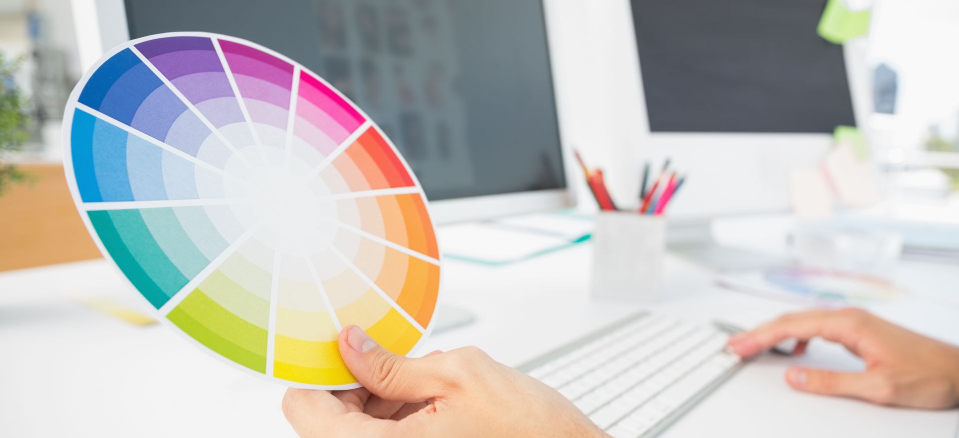
Opt for complimentary colours:
Complementary colours sit opposite each other on the colour wheel and create a vibrant contrast when used together. Incorporating complementary colours into your branding can make elements pop and evoke strong emotions.
Contrasting colours help elements stand out:
Applying colour contrast to a design causes certain elements to advance and others to recede. This determines which elements catch our attention first and signifies their importance in the hierarchy of information. The contrast between an element and its surroundings can also create this effect.
Simplicity is key:
Avoid overcomplicating your colour palette with too many shades or intricate patterns. Opt for clean and minimalist designs that are easy on the eyes and memorable for your audience.
This way, you’ll be able to seamlessly guide your user across your website to take your desired action.
Not sure where to start?
Here at Infoserve, our web design experts are on hand to help you create a website that engages your audience through the expert application of colour, and our PPC and SEO team help your website get found.